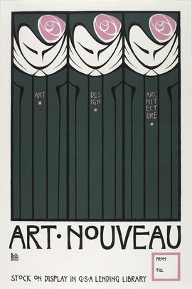
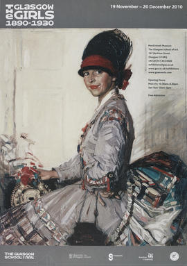
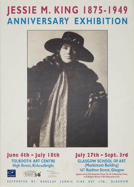
This poster for a major exhibition of painting, decorative and applied art by the Glasgow Girls from 1890 to 1930 uses an Eleanor Allen Moore painting as the background. It was a touring exhibition by the Kirkcudbright 2000 group. Over 100 exhibits were provided by the three main Scottish collections of 'Glasgow Girls' work - Glasgow Museums, The Glasgow School of Art and the Hunterian Gallery of the University of Glasgow, and the exhibition ran from 19th Nov to 20th Dec 2010. Artists and makers represented included Annie French, Margaret Gilmour, Norah Neilson Gray, Jessie M. King, Frances and Margaret Macdonald, Jessie Newbery and many others. Several private individuals also lent significant works, many of which had never been viewed in public before. The exhibition was curated by Liz Arthur, formerly a Glasgow Museums curator, who was involved in the last major exhibition on the 'Glasgow Girls' in Glasgow 1990. She also wrote a book to co-incide with this exhibition: 'Glasgow Girls : Artists and Designers 1890-1930' (Alba Printers Ltd, 2010). The exhibition was accompanied by a series of Lunchtime Lectures.
The following additional information was provided by the creator in September 2020:
"During my third year as a Graphic Design student, my fellow student Patrick Macklin who was studying Interior Design approached me with a request for technical help in producing a poster for the “Glasgow Girls” exhibition which he had been asked to produce. As this was the era of pre-digital, creating a poster for printing was quite a specialist task and was really the domain of Graphic Designers.
The artwork began by sourcing an archive image of historical female students in Glasgow School of Art in the Mackintosh era that could be scaled up to the finished size and retain a high enough visual quality. Because the concept that we decided on would heavily reference Mackintosh, I decided to use his signature violet colour and chose the exact colour from a pantone chart, that is so heavily associated with Mackintosh to create a duotone of the archival photograph.
Once I established the finished size of the poster, I drew by hand the printers marks that would establish cropping, registration of the separated colours and alignment of the layers on a sheet of heavy CS10 board (I think I did not eat for a couple of days to afford that board!).
The next stage was to create an area that would convey the information that the poster would communicate to the viewer. As this was the pre-digital era, I had to work out all the line lengths and the subsequent point sizes and weights required for the information block at the foot of the poster using type catalogues, rulers and casting off rulers. Once this was established, I requested to the operator of the GSA’s linotype photosetting machines to print out a galley proof of the type, once I was happy with the layout and weights of the type. I chose the font from the limited range that was available to the operator, as these fonts were mastered on glass slides that would be inserted into the linotype machine and were very expensive and therefore very limited in range. I settled on Book Antiqua as it was one of the least boring of the serif font choices and was also similar to the font used by Prefab Sprout in there “Swoon” album which I had nearly worn out the grooves of by that time!
I then used traditional art materials such as Letraset, drafting film, rubalith, rotring rapidograph pens and scalpels to create the text area. I hand drafted the dashed stroke around the border of the text area to invoke Mackintosh’s distinct use of these in his work. To create harmony and visual balance, I also hand cut a further two perfect squares using a half tone letraset dot matrix on a further layer to fill the void at either end of the “Girls” line of text to make a block so reminiscent of the Japanese wood cut influence in Mackintosh’s typography without being too literal.
It was really difficult in those days to source “camera ready” artwork for the sponsors logos, as companies in those days regarded any activity outside official Design Studios with the utmost suspicion. Eventually we managed to source these and I scaled them to the correct size using an Agfa Repromaster copy camera and the dark room. All these elements were then pasted on to the CS10 backboard or drafting film layers with measurement and precision using low tack spray mount.
The finished artwork was then sent to the Printer to be screen printed. I also supplied the pantone ink numbers they were to use for the screen printing in a list.
I was lucky enough to receive (as payment for my services) a “free” copy of the poster for my portfolio which I still have today!"
![Poster for 'Glasgow Group, 29[th] Annual Exhibition: Paintings - Print - Sculpture', Glasgow](/catalogue/uploads/r/the-glasgow-school-of-art-archives-and-collections/a/2/0/a20536e83d594cc781c3f8eafda224aba485f4eac4c3bd01071eed7dc6fc010c/GSAA_EPH_0010_0310_142.jpg)