- NMC/1974
- Item
- 2019
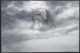
Charcoal drawing shown as part of Degree Show 2019. Drawn from north Kelvin Meadow.
Tayar, Atticus
1163 results with digital objects Show results with digital objects
Charcoal drawing shown as part of Degree Show 2019. Drawn from north Kelvin Meadow.
Tayar, Atticus
Stop motion animation board, painting of group
Painting of group of people, on board. One of ten boards used to make stop motion film.
Rowan, Sophie
'Idyllis' watercolour
Shanks, Kirsten
Untitled party #5, 'Bread and Circuses'. Oil on canvas.
Fernie, Angus
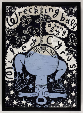
Wrecking Ball woodcut and cardboard print
Note from the artist: This print is part of the collection Wank!, a series of six posters for various sources - such as essays, video clips, movies or performances - all dealing with the taboo subject of female masturbation. Acting like a curator of these references, I aim to highlight that any attempt to represent feminine masturbation through a feminist eye still finds its limits where a branded masculine interpretation of feminine sexuality starts.
Campistron, Dominique
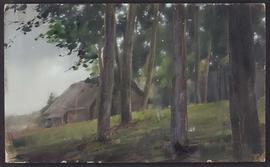
Oil painting of Lithuanian landscape
Oil painting on MDF board, Lithuanian landscape.
Morkunaite, Sigita
Framed oil painting of sunflowers. Annotated on reverse 'Sunflowers I Oil on board 61 x 51cm 2016 Hannah Mooney GSA 2017 graduate'
Mooney, Hannah
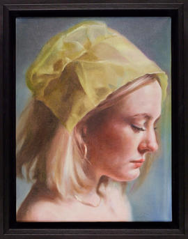
Female portrait study.
Clapham, Georgina
Watercolour and pencil study of female head
Morkunaite, Sigita
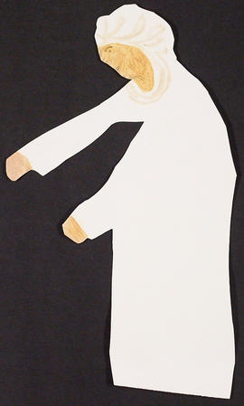
Figure - part of Degree Show studio installation
One of four small figures (oil on paper cut-outs), part of a larger Degree Show studio installation.
Rose, Bryony
Part of Papers of James Cosgrove
Sketches, drawings, paintings, collage, poems and notes. Includes entries relating to visit to Rijksmuesum, Amsterdam.
Cosgrove, James
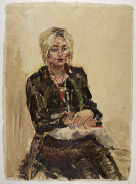
Portrait study of fellow GSA student, Kerry.
Snow, Rebecca Lucy
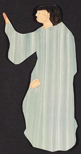
Figure - part of Degree Show studio installation
One of four small figures (oil on paper cut-outs), part of a larger Degree Show studio installation.
Rose, Bryony
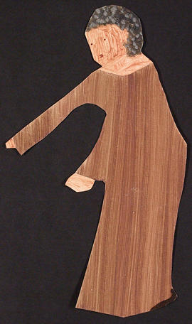
Figure - part of Degree Show studio installation
One of four small figures (oil on paper cut-outs), part of a larger Degree Show studio installation.
Rose, Bryony
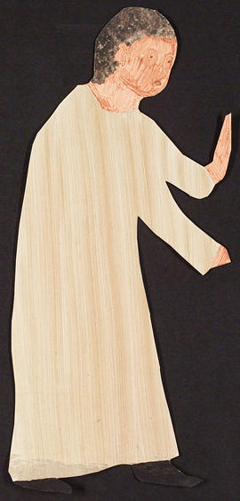
Figure - part of Degree Show studio installation
One of four small figures (oil on paper cut-outs), part of a larger Degree Show studio installation.
Rose, Bryony
Part of Papers of James Cosgrove
Poem sent from Mexico to Janet Cosgrove.
Cosgrove, James
Part of Papers of James Cosgrove
Painting including 4 standing figures, an aeroplane, and a dog. "2" written on the reverse.
Cosgrove, James
Photograph of Valerie Bloomfield-Ambrose's home interior
Part of Papers and Textiles of Veronica Matthew, student at The Glasgow School of Art, 1950s
Includes a corner of Valerie's home with painted artworks on the wall, cast sculptures, and a Tiffany style lamp; " Val + John's house / Florid. Oct. 2010" with a printed image verso. Has small white border and is glossy.
Not available / given
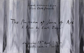
Poster for a film screening of 'The Passion of Joan of Arc'
Part of Records of The Glasgow School of Art, Glasgow, Scotland
This poster is part of a course project organised by the Visual Communications department. The brief for the project required students to design a poster for a particular film they had been assigned. In this example, student Robert Heatherington has designed a poster for the Carl Dreygar film 'The Passion of Joan of Arc'. Heatherington has created the poster using screen print techniques.
Heatherington, Robert
Part of Papers of James Cosgrove
Painting including the head and torso of a figure, a seated dog, and two birds. "3" written on reverse.
Cosgrove, James
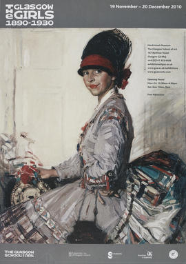
Poster for an exhibition of the work of The Glasgow Girls, 1890-1930
Part of Records of The Glasgow School of Art, Glasgow, Scotland
This poster for a major exhibition of painting, decorative and applied art by the Glasgow Girls from 1890 to 1930 uses an Eleanor Allen Moore painting as the background. It was a touring exhibition by the Kirkcudbright 2000 group. Over 100 exhibits were provided by the three main Scottish collections of 'Glasgow Girls' work - Glasgow Museums, The Glasgow School of Art and the Hunterian Gallery of the University of Glasgow, and the exhibition ran from 19th Nov to 20th Dec 2010. Artists and makers represented included Annie French, Margaret Gilmour, Norah Neilson Gray, Jessie M. King, Frances and Margaret Macdonald, Jessie Newbery and many others. Several private individuals also lent significant works, many of which had never been viewed in public before. The exhibition was curated by Liz Arthur, formerly a Glasgow Museums curator, who was involved in the last major exhibition on the 'Glasgow Girls' in Glasgow 1990. She also wrote a book to co-incide with this exhibition: 'Glasgow Girls : Artists and Designers 1890-1930' (Alba Printers Ltd, 2010). The exhibition was accompanied by a series of Lunchtime Lectures.
The following additional information was provided by the creator in September 2020:
"During my third year as a Graphic Design student, my fellow student Patrick Macklin who was studying Interior Design approached me with a request for technical help in producing a poster for the “Glasgow Girls” exhibition which he had been asked to produce. As this was the era of pre-digital, creating a poster for printing was quite a specialist task and was really the domain of Graphic Designers.
The artwork began by sourcing an archive image of historical female students in Glasgow School of Art in the Mackintosh era that could be scaled up to the finished size and retain a high enough visual quality. Because the concept that we decided on would heavily reference Mackintosh, I decided to use his signature violet colour and chose the exact colour from a pantone chart, that is so heavily associated with Mackintosh to create a duotone of the archival photograph.
Once I established the finished size of the poster, I drew by hand the printers marks that would establish cropping, registration of the separated colours and alignment of the layers on a sheet of heavy CS10 board (I think I did not eat for a couple of days to afford that board!).
The next stage was to create an area that would convey the information that the poster would communicate to the viewer. As this was the pre-digital era, I had to work out all the line lengths and the subsequent point sizes and weights required for the information block at the foot of the poster using type catalogues, rulers and casting off rulers. Once this was established, I requested to the operator of the GSA’s linotype photosetting machines to print out a galley proof of the type, once I was happy with the layout and weights of the type. I chose the font from the limited range that was available to the operator, as these fonts were mastered on glass slides that would be inserted into the linotype machine and were very expensive and therefore very limited in range. I settled on Book Antiqua as it was one of the least boring of the serif font choices and was also similar to the font used by Prefab Sprout in there “Swoon” album which I had nearly worn out the grooves of by that time!
I then used traditional art materials such as Letraset, drafting film, rubalith, rotring rapidograph pens and scalpels to create the text area. I hand drafted the dashed stroke around the border of the text area to invoke Mackintosh’s distinct use of these in his work. To create harmony and visual balance, I also hand cut a further two perfect squares using a half tone letraset dot matrix on a further layer to fill the void at either end of the “Girls” line of text to make a block so reminiscent of the Japanese wood cut influence in Mackintosh’s typography without being too literal.
It was really difficult in those days to source “camera ready” artwork for the sponsors logos, as companies in those days regarded any activity outside official Design Studios with the utmost suspicion. Eventually we managed to source these and I scaled them to the correct size using an Agfa Repromaster copy camera and the dark room. All these elements were then pasted on to the CS10 backboard or drafting film layers with measurement and precision using low tack spray mount.
The finished artwork was then sent to the Printer to be screen printed. I also supplied the pantone ink numbers they were to use for the screen printing in a list.
I was lucky enough to receive (as payment for my services) a “free” copy of the poster for my portfolio which I still have today!"
Devlin, Alistair
Photograph of Valerie Bloomfield-Ambrose's sculptures
Part of Papers and Textiles of Veronica Matthew, student at The Glasgow School of Art, 1950s
Includes a view of a living room with a focus on six sculptures of different people on a coffee table; "X Val's self portrait / Val's sculptures in their house / Florida, 2010" verso. Has small white border and is glossy.
Not available / given
Part of Papers of James Cosgrove
Painting including three figures. "4" written on the reverse.
Cosgrove, James
Part of Papers of James Cosgrove
Painting including 5 figures, boats and animals. "5" written on the reverse.
Cosgrove, James
Part of Papers of James Cosgrove
Small-scale painting of the head of a man surrounded by flying birds. With the words "Tambien de Borricas ay mascaras literatos".
Cosgrove, James
Part of Papers of James Cosgrove
Small scale painting of man and child.
Cosgrove, James
Part of Papers of James Cosgrove
Small scale painting of head and shoulders of a person in front of hills and buildings.
Cosgrove, James
Arizona Series Letter from America
Part of Papers of James Cosgrove
Collaged painting of the head and shoulders of a man with animal.
Cosgrove, James
Part of Papers of James Cosgrove
Collaged painting of street scene.
Cosgrove, James
Arizona Series Shadowman Number 26
Part of Papers of James Cosgrove
Collaged painting of the head and shoulders of a man with weathervane. Signed "COSGROVE".
Cosgrove, James
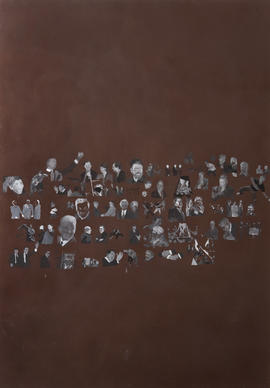
Cluster of small figures.
Zabala, Erlea Maneros
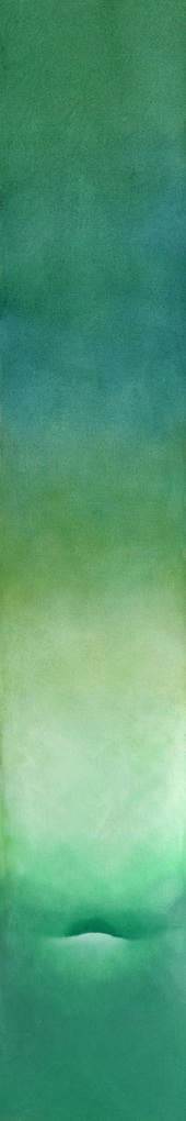
This item was lost in the fire in The Mackintosh Building at The Glasgow School of Art on 23rd May 2014. Blue and green abstract design.
Brown, Neil Dallas
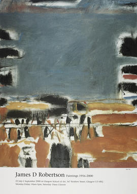
Poster for exhibition 'James D. Robertson Paintings 1956-2000', Glasgow
Part of Records of The Glasgow School of Art, Glasgow, Scotland
Poster for exhibition 'James D. Robertson Paintings 1956-2000', The Glasgow School of Art, 22 Jul 2000-01 Sep 2000. The artwork featured is 'Inlet', 1980.
*Not available / given
Suite of 9 works.
Richmond, Cathy
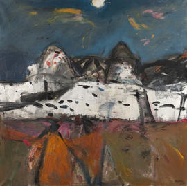
Abstract landscape.
Robertson, James Downie
Part of Papers of James Cosgrove
10 small paintings mounted on card. Landscapes, portraits and abstracts.
Cosgrove, James
Part of Papers of James Cosgrove
25 small paintings mounted on card. Landscapes, one portrait.
Cosgrove, James
Part of Papers of James Cosgrove
25 small paintings mounted on card. Landscapes, still life, portraits and abstracts.
Cosgrove, James
Part of Papers of James Cosgrove
Drawings and paintings, including landscapes and figurative representations.
Cosgrove, James
Part of Papers of James Cosgrove
25 small paintings mounted on card. Landscapes, portraits, and abstracts.
Cosgrove, James
Part of Papers of James Cosgrove
25 small paintings mounted on card. Landscapes, still life, portraits and abstracts.
Cosgrove, James
Part of Papers of James Cosgrove
15 small paintings mounted on card. Landscapes, portraits and abstracts.
Cosgrove, James
Part of Papers of James Cosgrove
Drawings and paintings, including landscapes, still lives, and sketches.
Cosgrove, James
Part of Papers of James Cosgrove
Illustrations, sketches, collage, including some loose drawings stored in the back pocket. Includes landscapes, seascapes, and portraits, and some writing about the weather.
Cosgrove, James
Part of Papers of James Cosgrove
25 small paintings mounted on card. Landscapes, portraits and abstracts.
Cosgrove, James
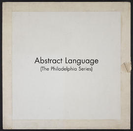
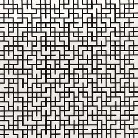
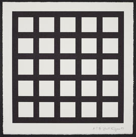
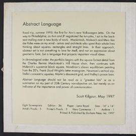
One print from 'Abstract Language' (The Philadelphia Series) (Version 2)
One print from 'Abstract Language' (The Philadelphia Series) (Version 1)
One print from 'Abstract Language' (The Philadelphia Series)
One of eight screenprints in a folder inspired by artists and architects who spent their whole lives thinking about squares, rectangles and straight lines: C R Mackintosh, Malevich, Modrian, Lloyd Wright, Newman, Stella, Martin and Halley.
Print 'A' inspired by C R Mackintosh. The screenprints are boxed with an introductory page.
Kilgour, Scott
One print from 'Abstract Language' (The Philadelphia Series) (Version 3)